Step 3: Creating the Home Screen with Components [KOBIL Docs]
The Home Screen defines what users see when they launch your SuperApp. All content inside the Home tab — banners, news, lists, packs, sliders, etc. — is built and structured using components inside the App Builder.
1. Understand the Default Home Screens
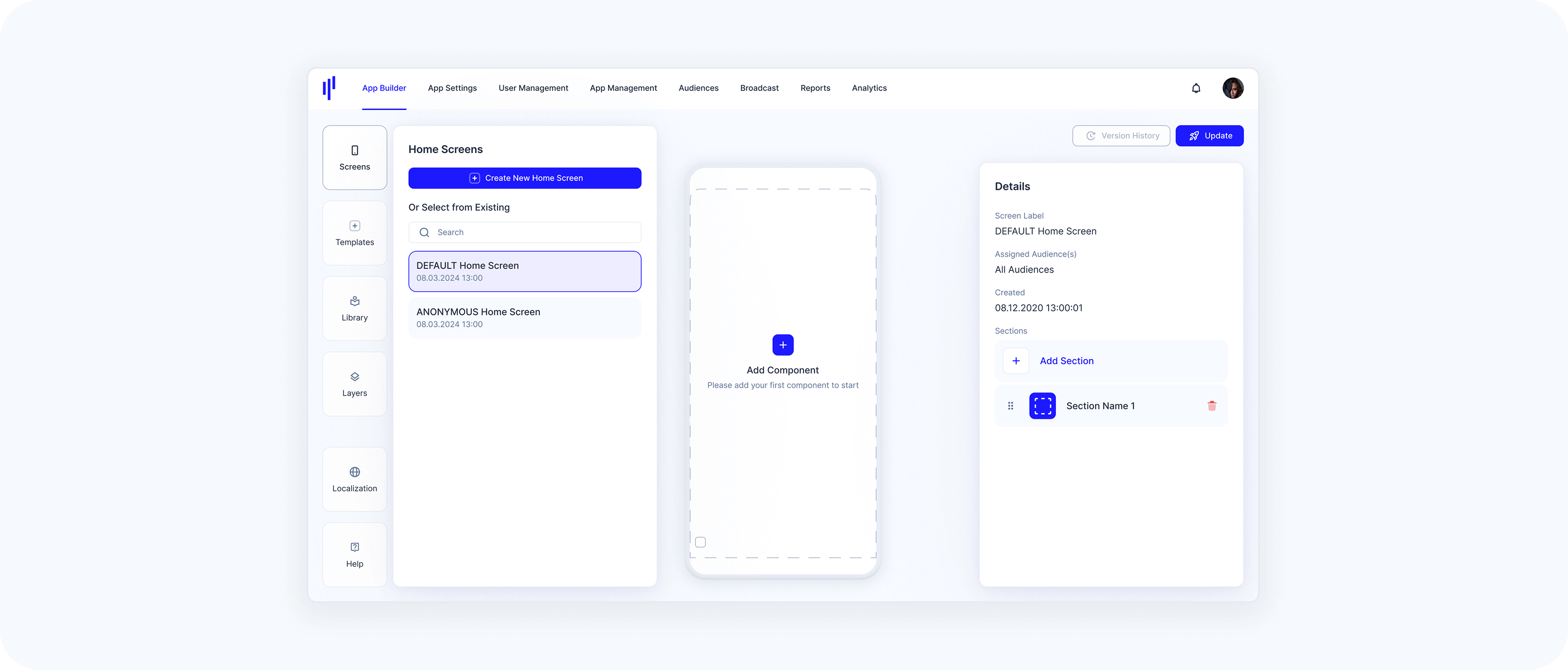
Each app starts with two preconfigured screens:
- Default Home Screen
- Visible to all logged-in users
Automatically assigned to the default audience (All Audiences/Users)
- ANONYMOUS Home Screen
Displayed to users who are not registered or logged in
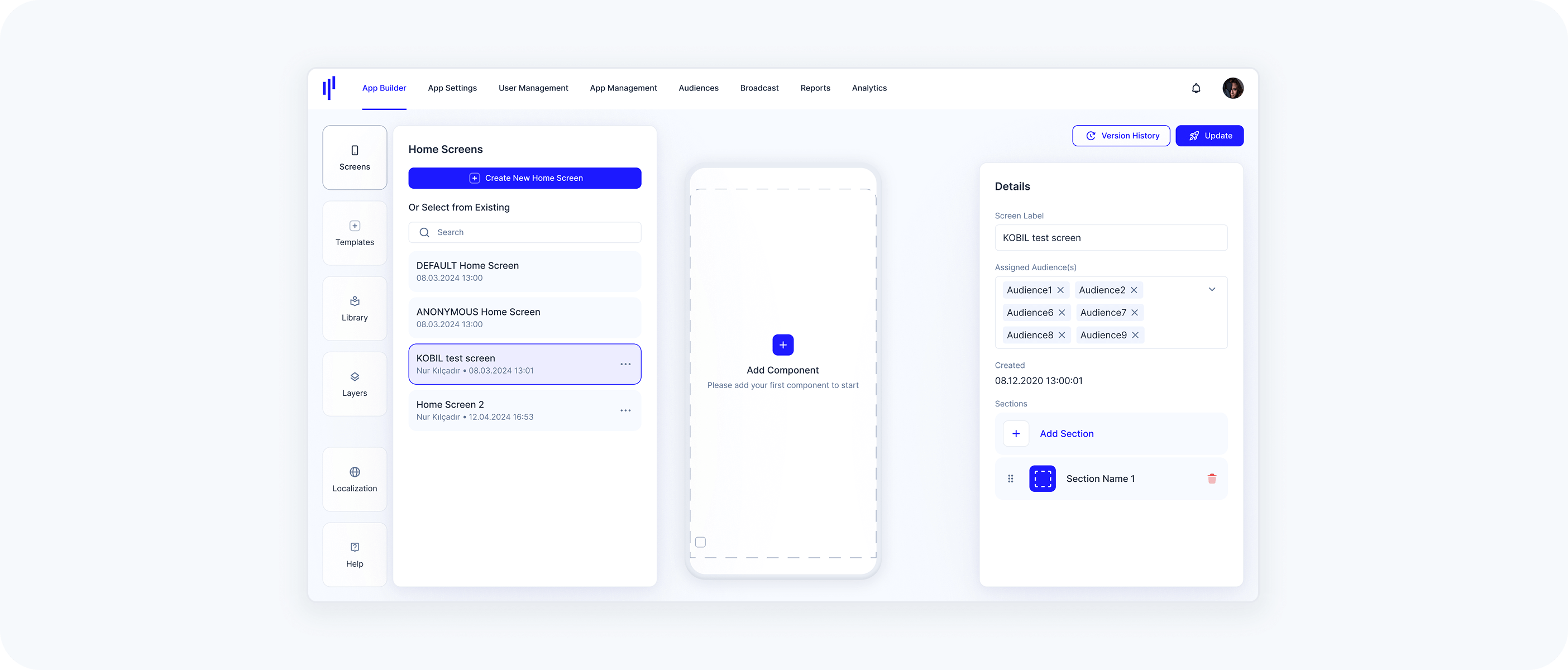
You can create additional Home Screens to target specific user Audiences if needed.
2. Create or Edit a Home Screen
- In App Builder, go to the Screens panel
- Open an existing screen or click Create New Home Screen
- Each Home Screen is made of one or multiple sections
3. Fill Section/Home Screen with Components
Each Home Screen is made up of one or multiple sections, and each section can contain one or more components. Components define the visual and interactive content of that section (e.g., banners, lists, sliders).
One section is always included by default. If you don’t add any additional sections, this default section will be treated as the Home Screen layout.
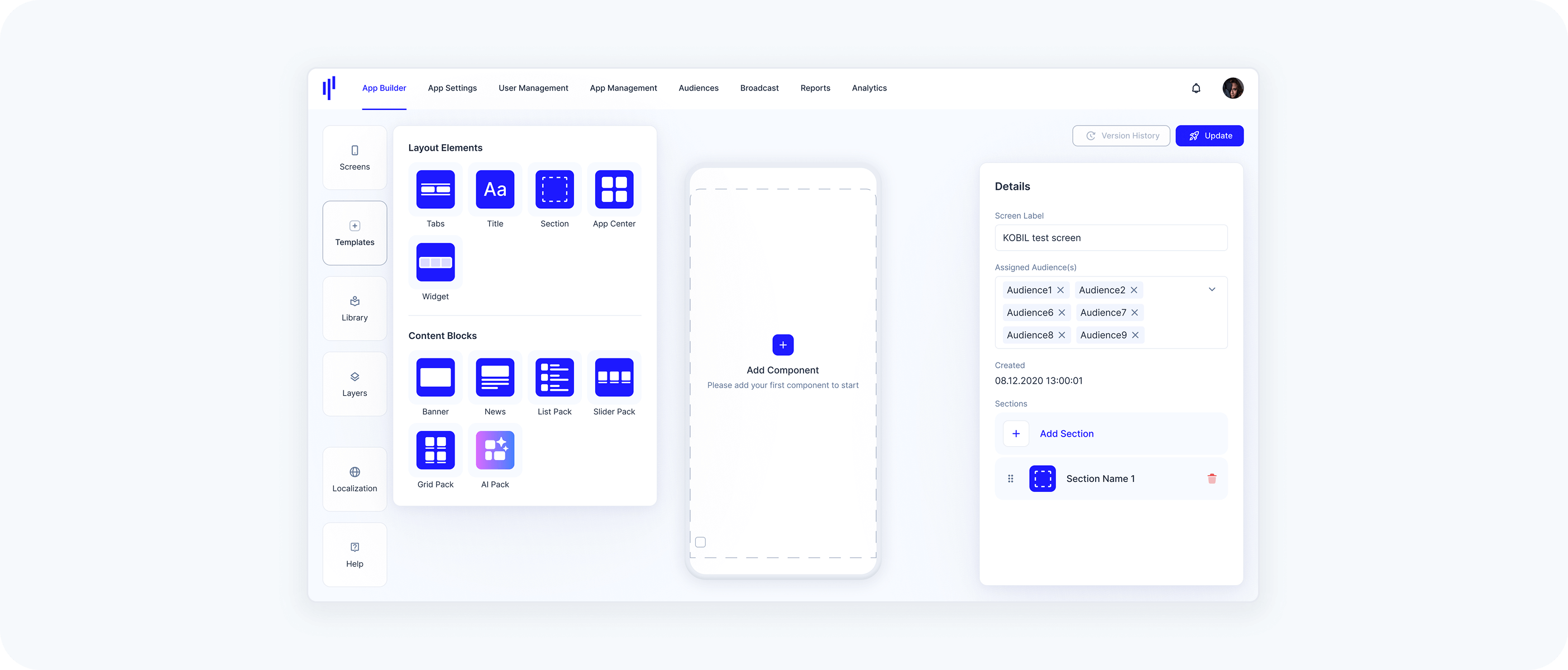
4. Using the Templates Panel to Fill Section/Home Screen
Click the Templates panel to access a collection of structure blocks you can drag onto your Home Screen.
- Available templates include:
- Layout Elements:
Content (Component) Blocks: Banners, News, List Packs, Slider Packs, Grid Packs, AI Packs
All template blocks are empty by default — they act as visual shells.
Here’s how it works:
Drag a section → The section appears empty until you add components inside it
Drag a Tabs block (optional) → Tabs always sit at the top of a section and allow users to switch between views
💡 You can mix and match: one section might use tabs, another might not
Each section can contain →
Component-based tabs: Show different components powered by services
Web-based tabs: Display embedded external content
- Or a combination of both
Drag a title block onto the screen → Then configure the title text and select a style
Drag a List Pack, Grid Pack, Banner, etc. → You must select service(s) for it to display content
You can mix and match: one section might use tabs, another might not
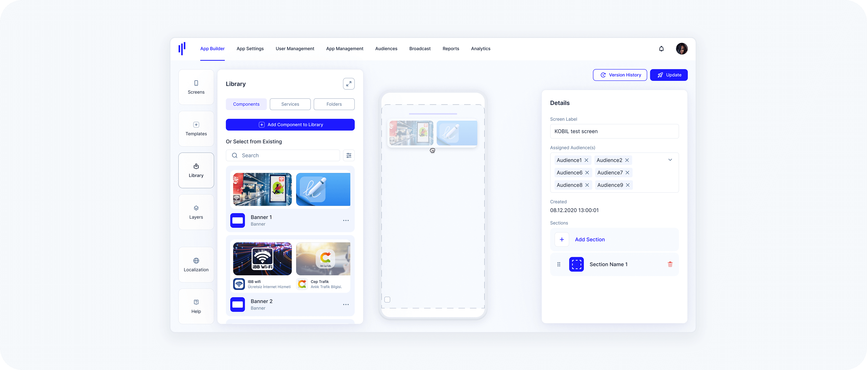
5. Using Existing Components from the Library to Fill Section/Home Screen
If you want to use a preconfigured component instead of starting from scratch:
a. Open the Library panel
b. Drag and drop the component from the list onto your Home Screen
These components are linked to the Library by default, meaning any updates made in the Library will reflect automatically. You can unlink a component if you want it to behave independently.