Step 4: Creating and Configuring Components [KOBIL Docs]
Components define how your services are visually represented in your app — like banners, lists, sliders, and more. You can either create one directly on the screen (with the Templates panel), or centrally manage reusable ones via the Library.
Option 1: Using the Templates Panel to Create Components (Banner)
Best for creating screen-specific or one-off components
The Templates panel lets you drag ready-to-use component blocks directly into your Home Screen layout. These components start empty — you configure them step-by-step.
How it works (Example: Banner Component)
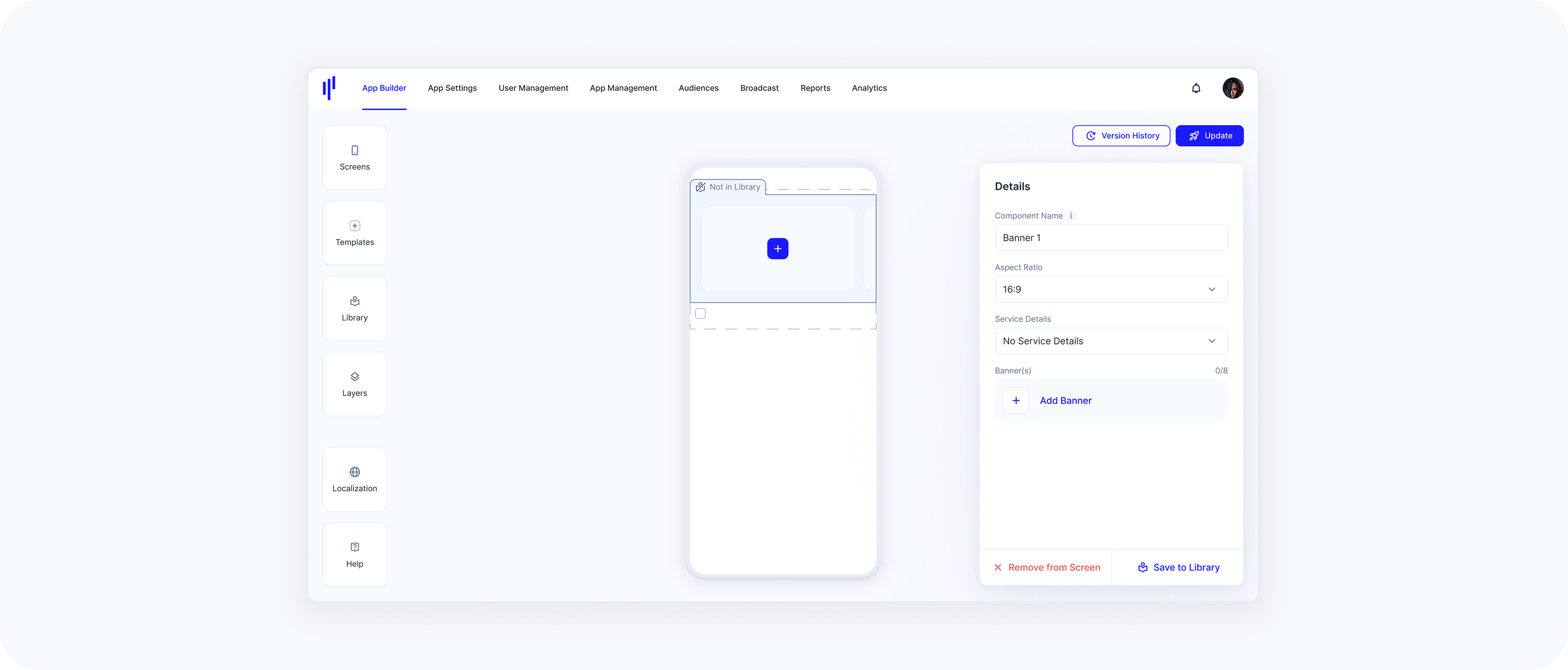
Open the Templates panel and drag the Banner block into a section
You’ll see it labeled “Not in Library”In the Details panel on the right:
Give your component a name
Choose the aspect ratio (e.g., 16:9)
Under Service Details, choose how the service will be displayed:
No Service Details → Only the banner media will be shown (no additional info)
Display Service Details Inside → Title & description from the linked service appear within the banner area
Display Service Details Outside → Title & description appear below the banner, separated from the image
These options affect the visual layout of your component and how content is communicated.
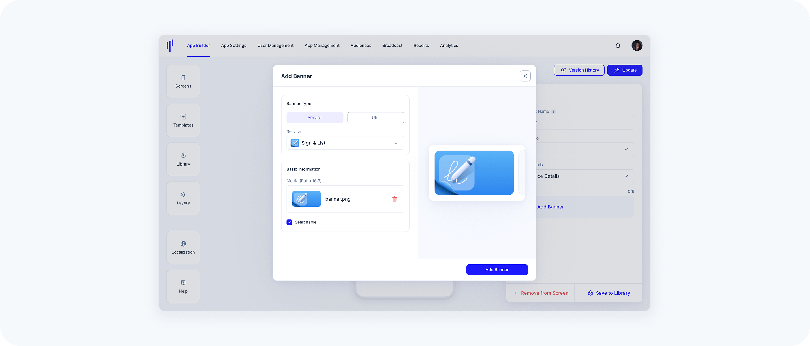
Click Add Banner
Select Service or URL as the Banner Type
- Choose a Service from the list
- Upload a media file (JPG/PNG, max 1 MB)
Tap the Add Banner button
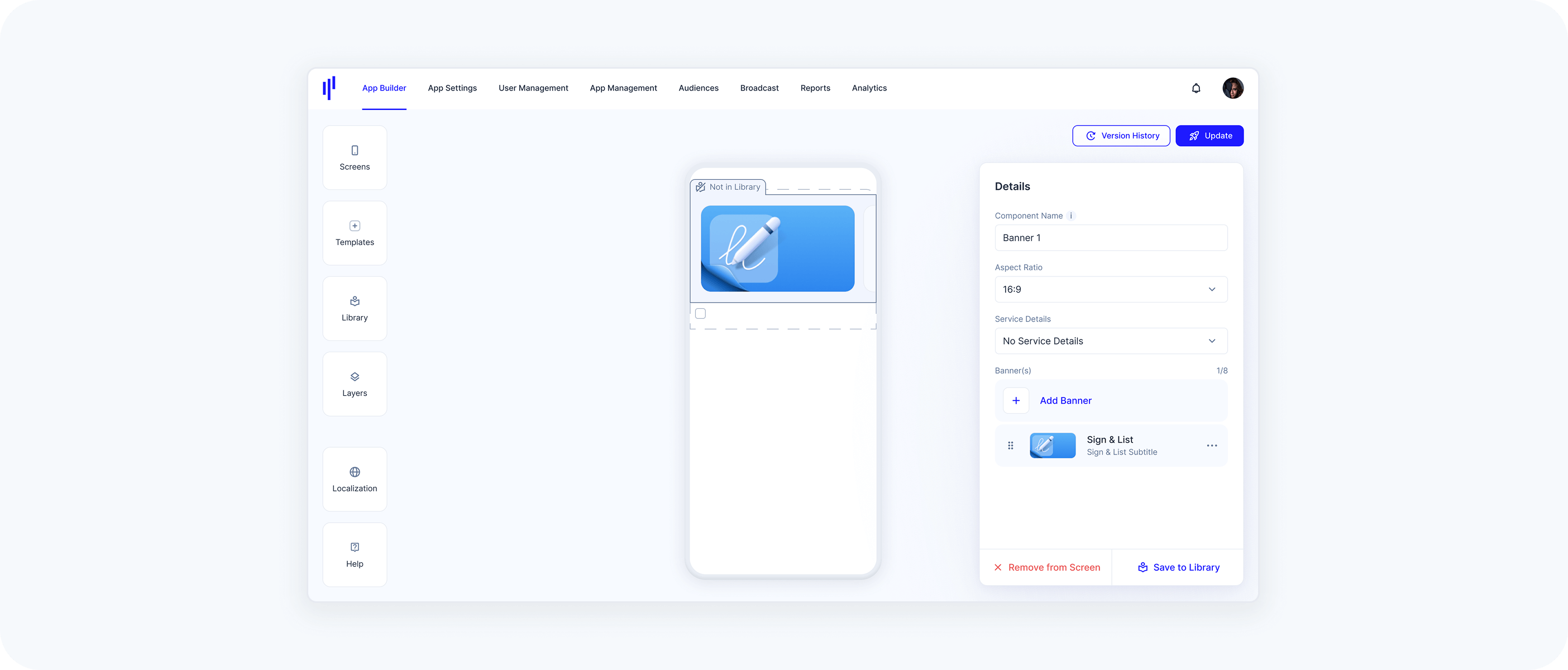
Once configured, the banner will appear on the screen preview
→ You can click Save to Library if you'd like to reuse it elsewhere
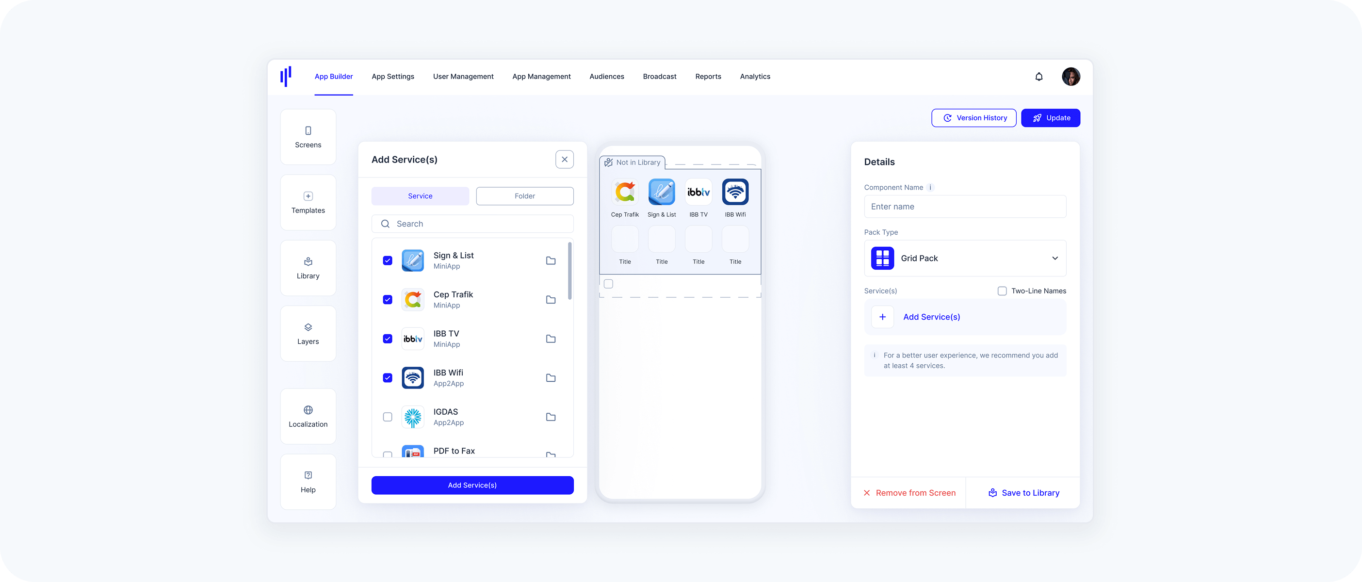
Option 2: Using the Templates Panel to Create Components (Grid Pack)
Pack components (Grid Pack, List Pack, Slider Pack) let you display multiple services in a visually structured way. These components are ideal when you want to present grouped content or a feature set.
Here’s how to create and configure a Grid Pack component using the Templates panel:
How it works (Example: Grid Pack Component)
Open the Templates panel and drag a Grid Pack into a section
You’ll see it labeled “Not in Library”In the Details panel on the right:
Give your component a name
- Under Pack Type, choose:
Grid Pack ‒ a block layout with icons and titles
List Pack ‒ vertical list with details
Slider Pack ‒ horizontal scrollable items
Click Add Service(s)
A modal opens where you can:- Select individual services
- Or choose entire folders of services
You’ll see a preview of the service name and icon when hovering
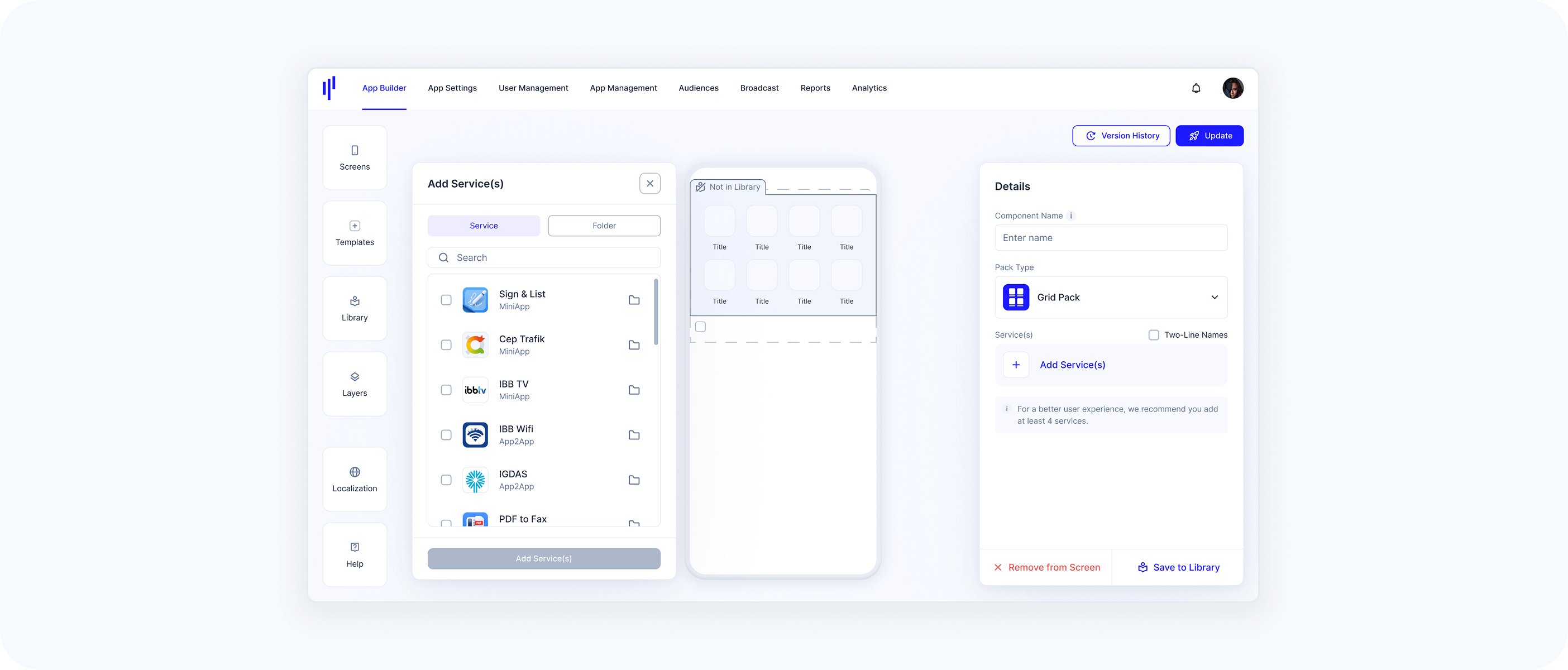
Click Add Service(s)
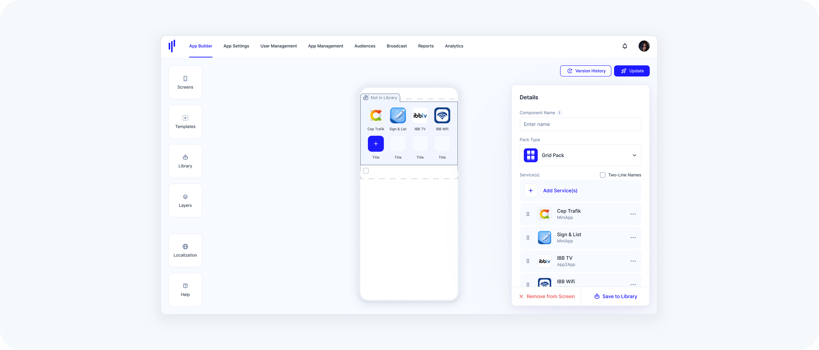
- The services appear visually in the grid
- You can reorder or remove them at any time
It’s recommended to add at least 4 services for a good layout in Grid Pack.
Click Save to Library (optional)
If you want to reuse the same pack structure on other screens, save it as a reusable Library component.
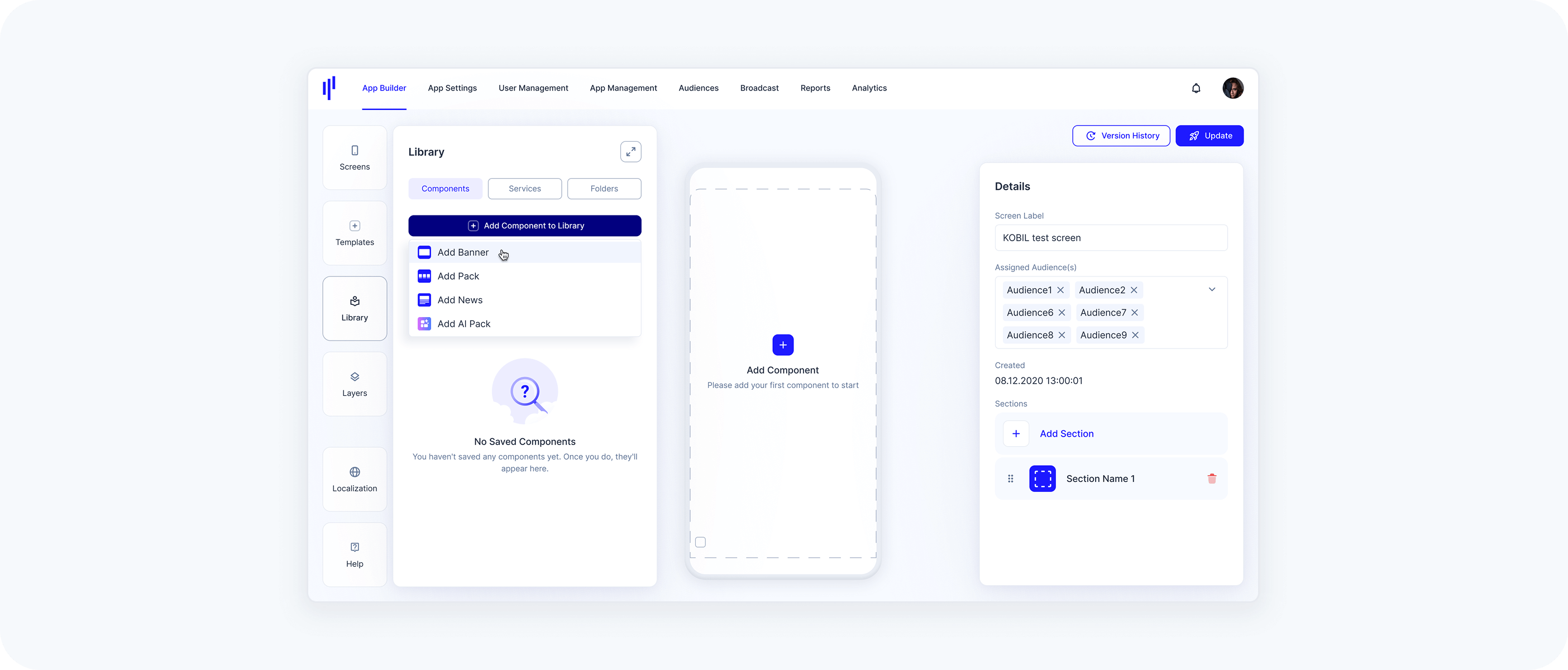
Option 3: Using the Library to Create Components (Banner)
Best for reusable components shared across multiple screens
The Library is the central place to manage all your components. Creating components here ensures consistency, makes updates easier, and saves time when you're working across multiple Home Screens.
How it works (Example: Banner Component)
Go to the App Builder and open the Library panel
→ The default view shows the Components tabClick Add Component
Choose the type you want to create:- Add Banner
Add Pack (Grid, List, or Slider)
- Add News
- Add AI Pack
Fill in the Details panel on the left:
- Component Name
Aspect Ratio (e.g. 16:9)
Service Details:
No Service Details: Just the banner image
Display Inside: Title and subtitle inside the image block
Display Outside: Title and subtitle appear below the image
Click Add Banner
In the Banner Details panel:Choose Banner Type: Service or URL
Select a service from the dropdown
Upload an image file (JPG or PNG)
Toggle options like Searchable if needed
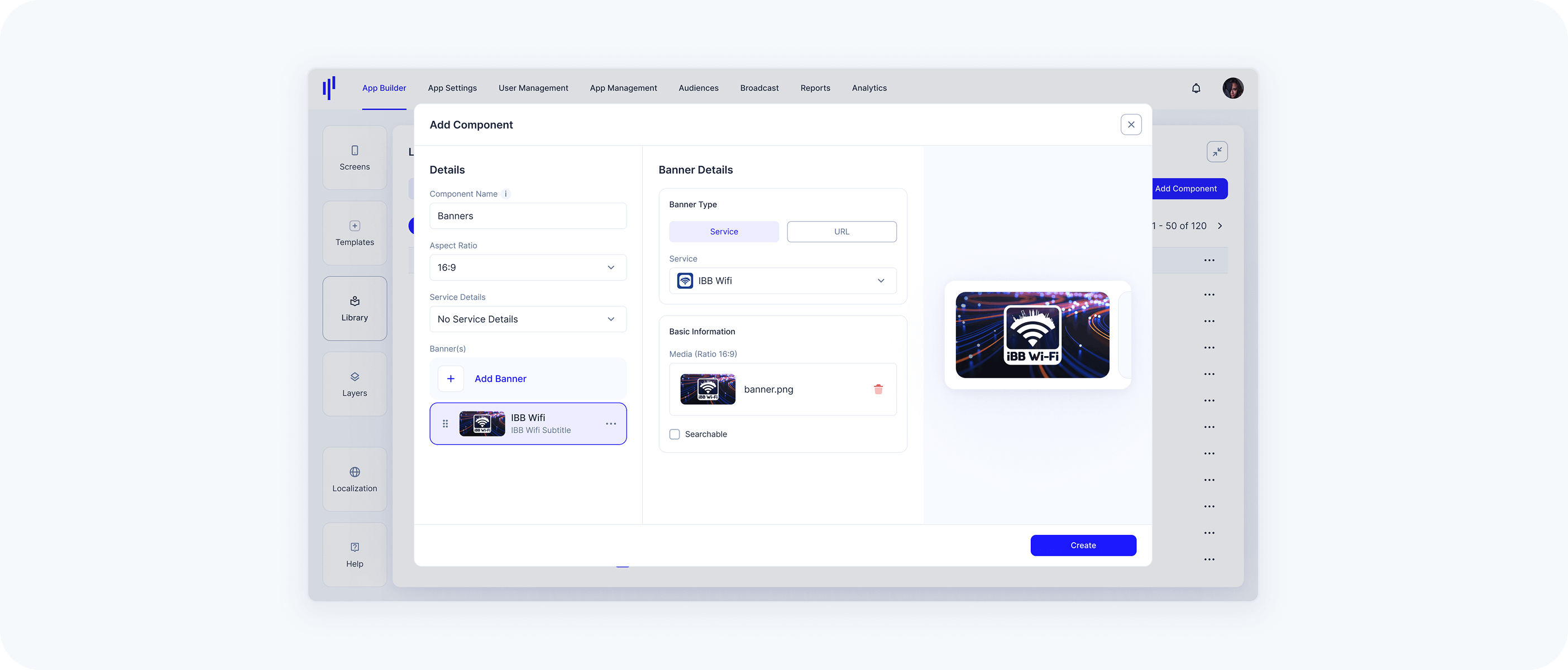
Click Create
→ Your component is now saved in the Library and ready to be added to any Home Screen